


Sure, here are 10 challenges with data visualization you may not see coming:
- Too much data. One of the biggest challenges with data visualization is dealing with too much data. When you have a large dataset, it can be difficult to find the patterns and trends that are important. This can lead to data overload, which can make it difficult to make sense of the data.
- The wrong data. Another challenge with data visualization is using the wrong data. If you use the wrong data, your visualizations will be misleading. This can lead to bad decisions and missed opportunities.
- Poorly designed visualizations. Even if you have the right data, your visualizations can still be ineffective if they are poorly designed. Poorly designed visualizations can be difficult to understand and can lead to misinterpretations.
- Lack of context. Visualizations are often used to communicate complex ideas. However, if you don’t provide enough context, your visualizations will be difficult to understand. This can lead to misinterpretations and missed insights.
- Over-plotting. One of the most common mistakes people make when creating visualizations is over-plotting. Over-plotting occurs when you try to show too much information in a single visualization. This can make it difficult to see the important patterns and trends.
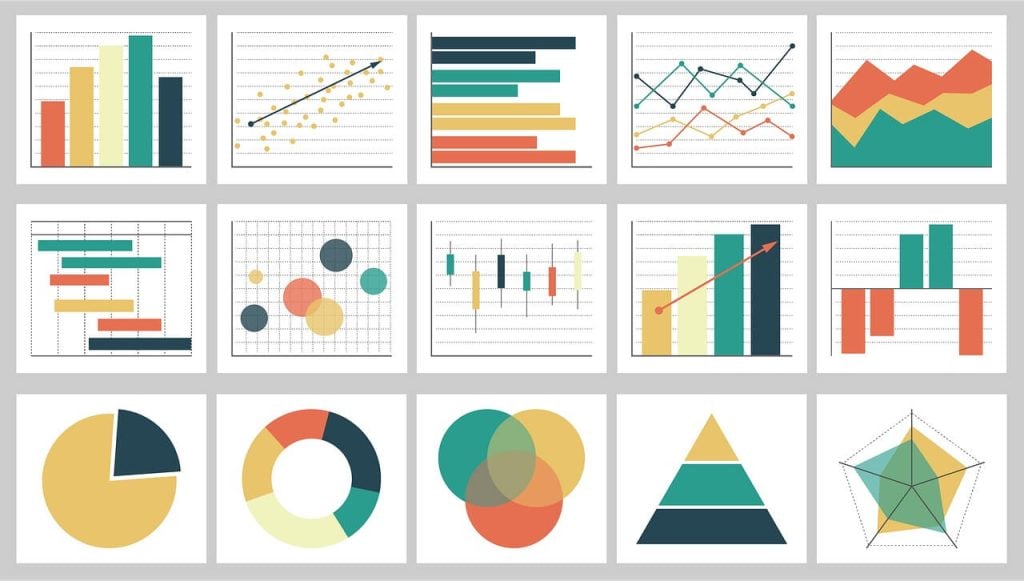
- Using the wrong chart type. There are many different types of charts and graphs that can be used to visualize data. However, not all chart types are created equal. Some chart types are better suited for certain types of data than others. If you use the wrong chart type, your visualization will be ineffective.
- Not using color effectively. Color can be a powerful tool for communicating information in visualizations. However, if you don’t use color effectively, your visualizations can be misleading. This is because different colors can have different meanings to different people.
- Not using typography effectively. Typography is another important element of visualization design. The font you choose, the size of the text, and the amount of white space can all affect how easy your visualization is to read and understand.
- Not testing your visualizations. Before you share your visualizations with others, it’s important to test them to make sure they are effective. This means showing them to people who are not familiar with the data and getting their feedback.
- Not updating your visualizations. As your data changes, you need to update your visualizations to reflect the changes. This will ensure that your visualizations are always accurate and up-to-date.
These are just a few of the challenges that you may face when creating data visualizations. By understanding these challenges, you can create more effective visualizations that will help you communicate your data effectively.
Here are some additional tips for creating effective data visualizations:
- Start with a clear goal. What do you want your visualization to achieve? Do you want to communicate a trend, compare two sets of data, or identify outliers? Once you know your goal, you can start to select the right data and chart type.
- Use the right data. Make sure the data you use is accurate and up-to-date. If you’re not sure about the quality of the data, ask a data analyst to help you clean it up.
- Simplify your data. If you have a lot of data, consider simplifying it by aggregating it or using a different chart type. This will make your visualization easier to understand.
- Use clear labels. Make sure your labels are clear and concise. Avoid using jargon or technical terms that your audience may not understand.
- Use color effectively. Use color to highlight important information and to create visual interest. However, don’t use too many colors, or your visualization will be overwhelming.
- Use typography effectively. Use a font that is easy to read and that matches the tone of your visualization. Make sure the text is large enough to be easily read.
- Get feedback. Once you’ve created your visualization, show it to others and get their feedback. This will help you identify any areas that need improvement.
By following these tips, you can create effective data visualizations that will help you communicate your data effectively.thumb_upthumb_downuploadGoogle itmore_vert